Exactly one month ago, on June 5th 2025, the European WordPress community came together in Basel, Switzerland for three days full of WordPress — it was time for WordCamp Europe 2025!
For me, this journey started about 18 months ago, when Patricia Brun Torre approached me and other Swiss WordPress community members to discuss this idea. Check out her recap post while you’re here. As a loyal WordCamp Europe attendee, I have been to every single edition since its inception 2013. Of course, we always talked about hosting it in Switzerland, but personally I was always very skeptical about the feasibility. Well, we made it happen!
While I’ve co-organized several meetups and local WordCamps in Switzerland, I’ve never volunteered or co-organized WordCamp Europe. This is my recap post.
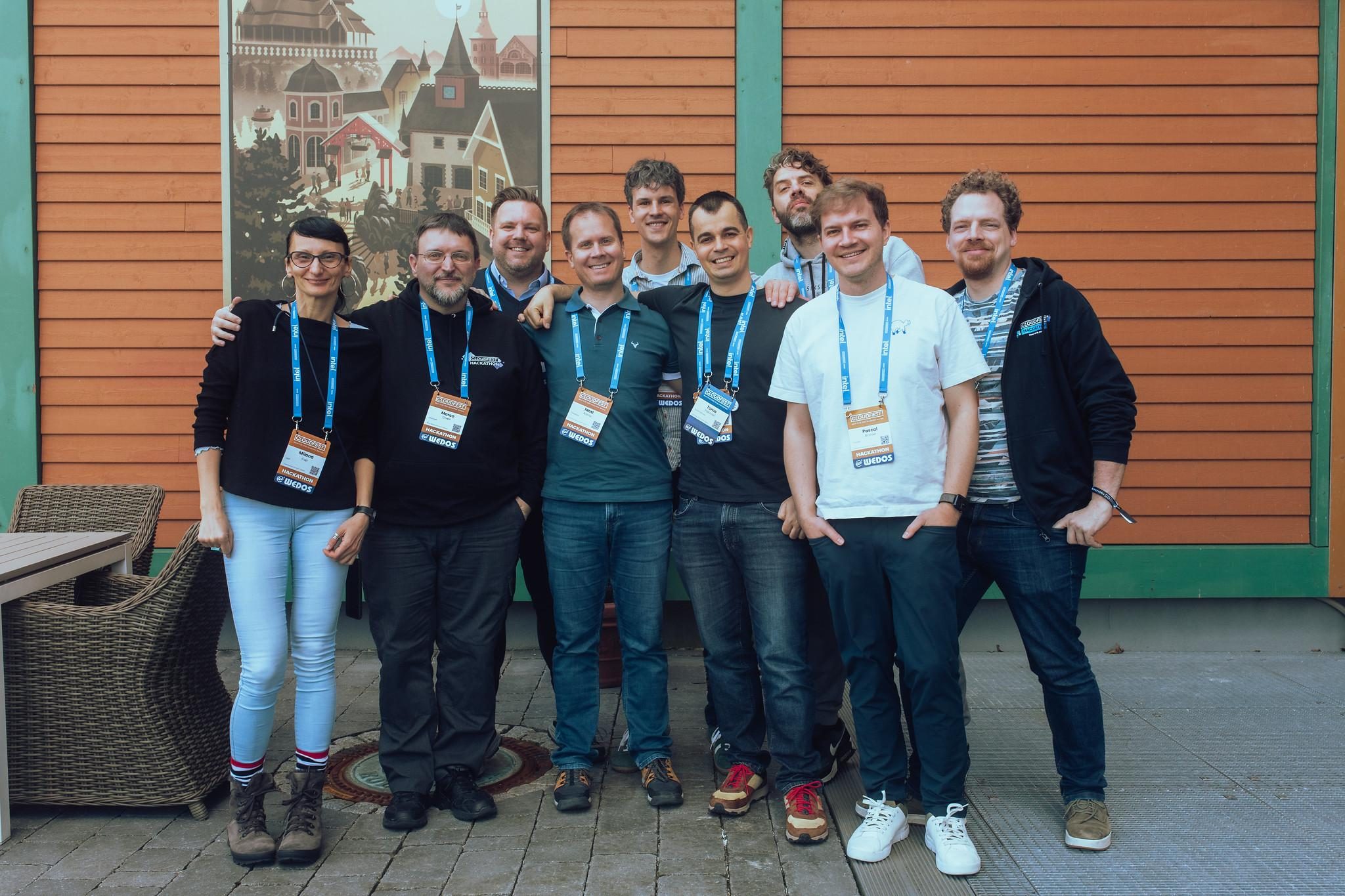
Speakers team
In early 2024, I joined the speakers team for Torino shortly before the conference to learn the ropes. For 2025, I led the speakers team (formerly known as content team).
This is an amazing bunch of people from all over Europe, and I was really glad to have them aboard. Thank you all!

Organizing WordCamp Europe means that every summer, the current team leaves the Slack channel and a new team onboards in autumn. Unfortunately, this means a lot of historical knowledge gets lost every year, and many things are learned over and over again because they are not properly documented. There are a few things to combat this:
- People behind next year’s application join the current edition early to get to know the process. This assumes that they will actually participate the same team next year, which is not guaranteed.
- Many people help organize multiple times, either in the same team or a new one.
- For the speakers team, we maintain a dedicated team handbook , trying to document everything as we go.
- For the speakers team, we did a retrospective meeting and documented some learnings after the conference, incorporating attendees feedback as well as our own.
Still, there are opportunities to improve this. For example by having a handover period where the old and new team overlap, or at least a dedicated handover meeting.
In all of this, a cornerstone of the whole conference is Production Pool, the company who has done the heavy lifting for WordCamp Europe since 2018. For the speakers team, this meant not having to worry about anything related to the tracks, stage, or presentations. We knew we were in really good hands there.
Social event
WordCamp Europe was held in Basel, which coincidentally hosted Eurovision this year as well. But most importantly, it is home to my favorite football club, FC Basel 1893.
Coincidentally, the social event (aka speakers/sponsors dinner) was held in the event lounge of the FC Basel football stadium. That means I absolutely had to wear a jersey for the occasion.

Schedule
At core of the speakers team’s tasks are to put together a diverse schedule of interesting, high-quality talks from a variety of voices representing the (European) WordPress community. I have to tell you, it’s not easy! Especially since the community was still in turmoil when we opened the Call for Speakers.
That was one reason why we had dedicated networking breaks in the afternoons, so that people can really get together in the hallway tracks. We also shortened sessions to 30 minutes, which I think worked really well.
It was great that we were able to introduce Mary Hubbard, WordPress Executive Director, to the community in a fireside chat with WordPress co-founder Matt Mullenweg. The Q&A after that was unfortunately way worse than anticipated. We can definitely do better there.
Apart from that, I am overall quite happy with how the schedule turned out. We received great feedback from speakers themselves as well, which is important too.
Sure, there are always things to improve, so the things we identified have been discussed already and documented for next year’s team.
Volunteers
In addition to the dozens of people on the organizing team, we have many people volunteering during the actual conference in all sorts of roles. For the speakers team, this includes assisting speakers and workshop hosts to ensure they have everything they need and are where they need to be. I’m really pleased with how smooth this worked for our volunteers this year. Special shout out to Andri, who has done a fantastic job as our de facto volunteers lead.
Unfortunately, the situation was quite different for other teams, for various reasons. I shared my feedback on this already and hope that this improves a lot next year.
This year we had incredible representation from Google at the WordCamp. Not only as a sponsor with a packed booth, but also on stage. The fantastic four:
- Mariya Moeva – What we learned from building Site Kit and how you can apply this to your WordPress site
- John Mueller – Mythbusting and Q&A about appearing in Google Search
- Adam Silverstein – Modernizing WordPress with new Web Platform Features
- (sadly Adam is now no longer at Google)
They were some of my personal favorites, and they were super well received by the audience too.
What’s next
There’s so much more I could talk about, like Alt Ctrl Org and the FAIR project, which was announced one evening. Or the many things I learned by helping organize such a large event. The many friends I made along the way.
In the end, what remains is this incredible feeling of pride. We made it happen. We put together a solid schedule. People came (over 1700!). Despite turmoil and cost.
What’s next? Well, I don’t see myself co-organizing the next WordCamp Europe. There are plenty of other talented folks who can help take it to the next level. I am sure they will do an amazing job.
See you in Kraków!